
Vizzy
Overview
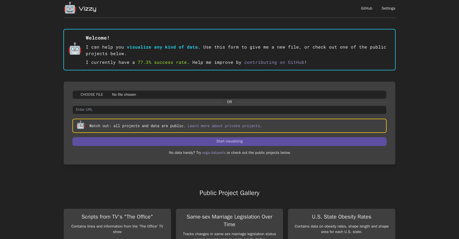
Vizzy is an AI-powered tool designed to help users rapidly visualize data. This tool can be connected to OpenAI via an API token, allowing users to take advantage of OpenAI's suite of AI tools.
As a data visualization tool, Vizzy can work with various types of data, making it a versatile choice for diverse fields ranging from public health information to geographic data.
Alongside this, Vizzy offers users the option to collaborate on public projects or check out samples from its gallery. With a broad spectrum of application, this tool can be used to track changes in legislation, understand obesity rates in different states or even analyze scripts from television shows.
In terms of making use of this tool, users are encouraged to upload their data files for processing. Furthermore, all projects and data used with Vizzy are public, although private project options do exist for users who need them.
For those interested in improving this tool, Vizzy encourages contributions on its GitHub page. One key aspect of using Vizzy is that while it is generally a low-cost tool, users are solely responsible for any charges incurred during usage, and are advised to set spending limits on their OpenAI account.
Releases
Top alternatives
-
 Smart insights for business, stunning visuals for creators.Harrison Oliver🙏 24 karmaJun 12, 2025@StatPeckerI felt there is need of more ready made templates. But, it does what it claims. I chose one question suggested by the AI agent, and it created the infographics in few seconds. It's cool. Saving it for future reference.
 -
 Turn raw data into instant visual insights.
 -
 Turn Data into Stunning Charts in SecondsI was just trying to get a quick graph showing population evolution over the last 30 years, didn’t have the dataset ready, so I was hoping the tool could auto-fill something reasonable. But it literally gave me three values. Three?? For 30 years?? What kind of trend can I possibly see with that? If the tool offers to research the data, it should at least offer a full timeline. And when I pasted the data I found, it created a literally bar chart???
 -
 Make Better Decisions with Data-Driven Charts, Clear Explanations, and Insightful Analysis
 -
 Generate visualizations from data using AI
 -
 Turn complex data into clear insights with AI.


